Peter Pan
Back to Home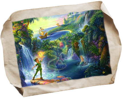
When I started designing this Peter Pan website, I wanted to get away from the branding that Walt Disney Company famously created. The original story of Peter Pan created by J.M. Barrie embodies tragedy, darkness, love, and immortality: All of which Walt Disney's branding fail to express. I really enjoy Peter Pan's darkness and innocense. So I designed this website is a variety of dark and light blues.
The pocket watch was a photograph taken by me, hoping to capture the essence of the time that Peter Pan has abandoned. As a boy who will never grow up, he will never hold onto any lasting or constant relationship with the people he meet. And being that he is a boy, he is forgetful. Time is his enemy and his friend. I hoped by using the pocket watch as this web design's main center piece, would successfully capture that fact.
For this website, I used a split combination of sans-serif and serif fonts. The serif type faces, which are Georgia and Jupiter, was meant to bring out Peter Pan's as a timeless masterpiece. The script font that was used for the main Peter Pan masthead, is Edwardian type. The curves of that typeface manages to bring a sense of nostalgia to the audience.
The sans-serif typefaces used are Univers and Arial. The reason behind using such modern fonts, is beautiful I want to tie the past in with the present. Peter Pan is a story for all ages, so I wanted to show that current elements can be used to describe Peter Pan as well